UI/UX Designer Skills Valued by Facebook

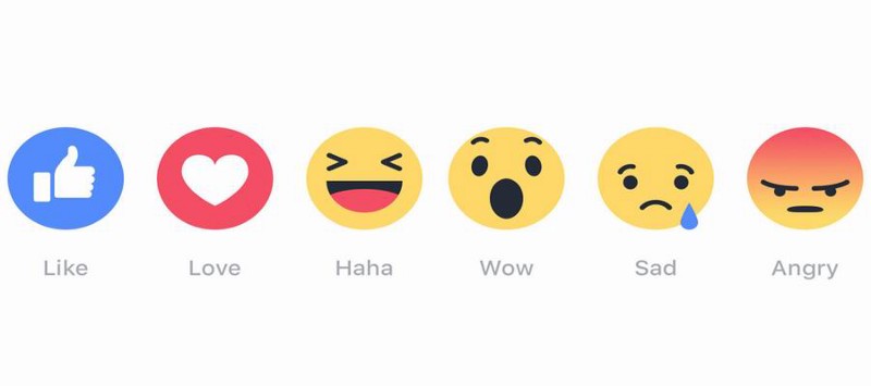
My friend Cynthia wasn’t a fan of social networking. It’s hard to find her in any online circle, except for Facebook, where she occasionally kills her time. However, yesterday she told me that she’d fallen in love with FB. On the 2 anniversary of her registration, she just logged in the community and found a video clip customized for her. In that video, her avatar was printed on a badge, picked up by a hand with dark skin and was put on table in the middle of many badges printed with the avatars of her friends, accompanied by another badge, on which there is a line, “Thank you for your accompany and not forgetting” Cynthia was deeply moved and played the video back over and over again. Facebook, a community with over 200 million users, totally won her affection by its focus on users. It’s no wonder that so many designers dream of becoming a member of the social network giant.

Facebook never made its process of selecting a UI/UX designer public, but if you are concerned about the presentations by its designers or PMs, like the series of “How a Facebook Designer Think?” by Julie Zhuo, you may find those people really have something in common. Since these qualities are not innate, in this article, I prefer to call them “ui ux designer skills”.

1 User-Centered Mind

What is a user-centered mind? First, make sure that you are making a product from the perspective of its users. It’s easy to fall into “seller thinking” when we make a design. For example, “How to design this button to improve click-through rate?”, “Does orange color stimulates users’ desire to buy better than green?”. These questions show that we pay more attention on our own objectives than users’ demand. The founder of Ford Motor Company Henry Ford’s ever said: “If I ask my users what are their demands, they’ll only say they need a faster horse.” Then how to make a horse faster? To give them better feed? Reduce the saddle weight? Why don’t we replace horse with a better transportation like a car? That is the heart of the matter since users want a faster horse because they want to reach their destinations more quickly.

Why can Facebook give us the best user experience? In the movie “The Social Network”, young Mark Zuckerberg realized that people have strong curiosity about others’ personal life, that’s the initial reason to register a social community like Facebook. Gradually, they get used to share their own life with others and expect a constant concern from their friends, colleagues or even strangers. Helping people to build a strong connection with external world; enabling them to follow and be followed, these are what a social platform was born for. When Facebook has become a part of our daily life, it is not the platform which we cannot give up, but the satisfaction we get from being concerned about. That also shows that an ideal product can not only satisfy its users by powerful functions but also meet their mentality needs. Paying attention to both the objective and subjective needs of users is among those important ui ux designer skills valued by Facebook.

2. Know the Importance of Humility

A designer who makes meeting users’ demand their ultimate goal must be one with humility. They design neither for trying new things, showing off nor purely doing what they want, but for solve the real problems of users. A rational designer will never misled by the honor of a team or their own. Their designs have nothing to do with “The product of our company has to win” and they don’t make “designing the best product in some field” their goal since those are not what customers care about.

The importance of humility has been diminished in today’s world. Here I’m not discussing humility as a virtue, but an ability a mature, experienced ui ux designer should have. If the designers at Facebook don’t know the importance of humility, they wouldn’t have made the avatars of over 20 million users to badges just for bringing instant joy to users. The “not forgetting” Facebook presented to its users is exactly what FB’s been doing. I believe that, to make users feel that they are concerned is the initial mission of a social platform, and Facebook will never forget it. That’s why it’s the designers with humility are what Facebook looking for.

3. Keep Up With the Trends

The present and future of users is the key, not the past of them. This determines that as a designer you should always keep up with the trends. Whether you are a UI designer, interaction designer, visual designer or UX designer, if you know the design trends in 2017 like a book, congratulations, you are valued by Facebook to some extent. “Trends” sounds like a very light word, but there are in fact a lot of things behind it. As a designer, how to get design information at the first time and transform them to design ideas & use them in reality to solve people’s problems are a strict test of designers’ sensibility and divergent thinking. On another hand, behind a constant following of trends are two words really hard to write: “passion” & “persistence”. A disdain to trends are caused by arrogance and idleness.

Whether or not Facebook is the right place for you, these 3 UI UX designer skills will constantly sharpen you and make you a really excellent UI/UX designer.

Related Reading:

5 Excellent Websites with Best UI Design 2017

To build the “websites with best UI”, a large quantity of factors should be taken into consideration. Websites with great user interaction must make users feel at home and extend their reach at the first entrance of a website. The approach to making this happen differs from culture to culture, for example, you can satisfy a Japanese and an English man at the same time. So, “websites with the best UI” are those, which are precisely targeting at the aimed region. While multicultural features are essential and indispensable if the site is meant for global usage.


In 2017, the 5 Websites with best UI design stand out in the following 5 dimensions:

If you take a in-depth look into the start points of these wonderful sites, you may find that rapid prototyping tools were adopted by most of them. This laid a stable foundation for their fast iterative development in the fore-steps of websites building.

  •  High quality images

Photos are the most eye-catching features that hit users on the first sight of your web page. Outstanding websites resemble in covering their pages with high-resolution images to exhibit their products from every possible tantalizing angle.

  • Straightforward navigation

This idea is easy to grasp. Nowadays, everyone is in a rush. If users cannot find what they want on your site, they just quit.

  • Thought-provoking slogans

Clever UI designers put thought-provoking slogans everywhere on their homepages from sliders, headers to pop-up forms. Once one of the slogans hits the bull’s eye, you get a new order.

  • Gorgeous and unique layout

A stunning layout can make your website unforgettable. Even for visitors who fails to stay might return because your products are laid out with creativity rather than caged in the old-fashioned grids.

Based on these dimensions, I put together a list of 5 excellent websites with best UI design who have broken the norm to become extremely memorable.


Airbnb

Airbnb

Airbnb is not the most fascinating website I’ve seen but it does “make the world a better place” by simplifying the process of booking a stay. The whole process is streamlined to make the page easy and approachable. Guest will be immediately guided by the slogan”Where to? Start your next adventure on Airbnb.” and start booking right away by the “Check in” box below.

Medium

Medium

Medium astounds me by minimizing the use of color, in which way it puts better emphasis on the content. As a writing platform, Medium has chosen the most suitable kind of typography. Every line and box are encouraging users to write, browse and share.


Defringe

DEFRINGE

Defringe is an online gallery that dedicates to filtering art and other creative content on the web. For its navigational method, it uses a left menu which resembles music software much to allow you to explore the website. This is quite inspirational.

FS Emeric

FS EMERIC

FS Emeric is a website which is a little futuristic. I do love the layout of the scrolling side embellished with the special font design at the right corner.


Boostedboards

boostedboards

Boostedboards purposely weakens the sense of UI so that visitors will concentrate on the product. High-resolution images of enthusiastic skaters fill every page of the website and are nicely divided to be friendly for viewing. Boostedboards best exemplify the using the images

Conclusion

In fact, what these websites with best UI demonstrate is not how to resort to trickery but better ways to communicate through your website ui design and get your idea through. Examples discussed above are just a small part of my favorites. Check out to learn How to Learn UI Design From Zero-Basis

Why Digital User Experience Always Has to Come First

Advances in digital user experience design are changing customers expectations and enabling them to be more addicted to rich, interactive and engaging digital experiences. As user perception becomes more and more critical, bad designs can no longer act as a stopgap. That is why digital services, especially mobile advertising, provide outstanding templates for evaluating business model.

Today, the importance of digital user experience goes beyond the screen design. Accessibility has become the key to making responsiveness a basic design feature and expecting flashlight towards micro-interaction. Easy-to-buy process, all-round support, and a positive experience for each tiny point have become the key to ensuring customer retention. As a negative example, Facebook makes a large amount of money for mobile advertising, but its now giving up further investment in optimizing technical efficiency, which, ruins its entire user experience. Consequently, 40% users turn off the Facebook App during 3 seconds of the unendurable loading time.

 Facebook.jpg

“We wanted to know what people find useful when they look at their friends’ profiles.” says Facebook UX researcher Shivani Mohan. “And what do they not find very useful? When people are going to the profile of a person who is not their friend, we wanted to know the same thing.”

If the page can be loaded fast, this cant be wrong. But it cant. It is very often that we confuse digital UX design and UI design. The most common mistake is to take a delicate interface as the best representation of good digital user experience. In fact, interface design or interaction design is only a small part of a much broader category. Digital UX is fundamentally the solution to the relationship between people and technology. With more and more appearance of diversified forms of technology such as wearable devices and VR/AR things, the conception that digital UX equals to interfaces will accelerate to fall apart.

 UX VS CX.jpg

To thoroughly understand why digital UX design always has to come first, we must also take a deep look into the action promotion where we tend to put the cart before the horse. Actually, digital user experience is the basic nature of design. Then, what is the design that we keep talking about everyday? Generally, design is about making things that people want while promotion is about making people want things. Note that the difference hide in the cores of them, namely product and profit. UX designers need to explore every possible way to optimize product and sometimes they challenge the current habit of consumption. This might be an explanation that we see marketers quarreling with designers. By the way, mature and intelligent marketers never do that because they have learned the full story.

As a matter of fact, making digital user experience the first priority in the design process can benefit a company in many positive aspects:

1.Cultivate customer loyalty in a far more effective way

2.Improve conversion rates while advertising to fans

3.Lower support cost because of users habits brought by your painstaking digital user experience design

4.Create a virtuous customer-to-company circle

To reap these benefits, many temptations should be withstood no matter for the giants like Facebook or small businesses. Do remember that design is about making things that people want while promotion is about making people want things. Ask yourself: what is badly wanted by the market? You may finally get your own answer of why digital user experience always has to come first.

Let’s Make Prototype: Preview Function of Four Prototyping Tools

In these years of working as an UX designer, one of the things I have understood is that: Prototyping design is an essential part of upgrading product development. So, it is very important for us to demonstrate our prototype in a right way. I made a comparison for the prototyping tools that we daily use, and the comparison shows that each one of them has its own merits. Well, today, let’s talk about the preview function of Axure, Justinmind, Mockplus and Proto.io 6.

Axure:★★

Axure should be the most common tool of prototyping, after years’ accumulation, it has become a really powerful software. Also, the preview function of Axure is absolutely not the weak spot, and we could say that Axure has the most available options of exporting HTML.

Axure supports two ways of preview on mobile device, one is exporting HTML which is especially made for mobile device (you could open it with Safari on iphone), the other one is to upload project and open it with an app named Axure Share.

Justinmind: ★★

Justinmind is a prototyping tool which comes from Spain. It’s not so common like Axure, but there are a large number of people using Justinmind. The HTML exporting function does not have that many options like Axure. So if you want to preview on mobile device, you could extract the zip file in your cellphone and then open it with browser. Although Justinmind app does not support offline preview, but the online preview function is pretty good if you compare with other apps. There’s only one shortcoming: the running speed is a kind of slow. Of course, it also supports exporting into picture. Another thing we should mention is that Justinmind supports exporting DOCX files, and this would make PRD writing much easier.

Mockplus:★★

Mockplus has the most comprehensive ways of preview among all the prototyping tools so far I have seen. Don’t even mention the basic function of exporting into picture in two formats. It has two ways for preview on cellphone app: scanning QR code and entering view code after uploading project to cloud. QR code scanning for preview is really rare in this kind of software. You don’t need to connect to the computer, or upload the project to cloud, just open your app and scan the code. It’s very convenient. Exporting into demo package is also a rare but useful function which Mockplus has. Beside those, I also have heard something from a friend who’s inside Mockplus: 2.2 beta version which has the function exporting into HTML is already in the test, and the launch of 2.2 version should come soon. The HTML exporting of Mockplus has two ways: first one is to export offline package. You could send this package to your colleagues directly or put it on the local sever for downloading and preview. The second way is the way of online HTML preview. After publish the HTML online, you could send a link to people who wants to have a preview on your prototype.

Proto.io 6:★★

Proto.io was upgraded to Proto.io 6 in the middle of July. Compared with the other three desktop prototyping tools, Proto.io 6 only has web version for now.I think it should be the reason of why Proto.io 6 does not have that many ways of preview. Proto.io 6 supports exporting offline HTML, PNG picture and PDF.

Comprehensive evaluation

From the view of static prototype:

Those four prototyping tools are at the same level, because they all support exporting pictures. However, Mockplus does not have the function of exporting PDF, so it might be inconvenient for the users who have the need of PDF.

From the view of dynamic prototype:

The ways of preview of Axure and Justinmind are similar to each other, as they both have mobile app which is totally okay for normal preview. Also they both support exporting HTML offline package.

Mockplus has the most comprehensive ways of preview, you could choose one according to your condition. So, in terms of preview, Mockplus is better.

Proto.io 6, as a prototyping tool based on web version, does not have so many ways of exporting, it really needs to be improved. But if it’s just for the basic needs, the function of preview should be enough.

By the way, there are two ways for preview on mobile device:

Preview by HTML:

Pros: You don’t need to install an app on your phone.

Cons: It will not run very smoothly like it runs on app. Also, it’s not easy to preview in your phone full screen. There is still one more thing need to concern, it would be the compatibility of the browser. This might lead the problem of distortion, your prototype might look different from designing.

Mobile device app:

Pros: It won’t be a problem for the app to run your prototype smoothly without distortion.

Cons: You have to install an app.

So, which way is better? My advice would be: Make decision depending on your own condition. Of course, a tool which supports both ways would be a better solution.

This article just sums up a few of my thoughts. If you have different ideas, please tell me, we could talk about this in depth.

Top 8 Prototyping Tools Recommended in 2017

A famous designer once told me a joke:“If my wife is pregnant,does it mean I’m a prototype?” The joke was funny and did hit the nail on the head, because it is no doubt that prototyping is a vital part of giving life to a new design. Once, Photoshop played an important role in the field of UI/UX design. However, according to a survey by the end of 2016, designers who love to try moreprototyping tools are more likely to stand out. So which prototyping tool is the best? Frankly speaking, I don’t know. Actually the right question ought to be “Which prototyping tool suits my needs better?” After testing a large number of prototyping tools, I made a list of the stunning ones based on:

1.The mostly mentioned on the Internet

2.Colleagues recommendation and personal preference.

3.Something really blew my mind while using

4.Detailed function and price analysis

1. Axure RP

axure-rp-8.png

Cost

Monthly – Pro: $29, Team: $49, Enterprise: $99 (Only in the latest version)

Perpetual licenses – Pro: $495, Team: $895 (Only in Axure RP 8 and all 8.x updates)

Yes, you got me, Axure is again listed first and I believe it’s well-deserved. As the largest and most well-known application in the whole prototyping industry, it is powerful in quickly creating high-fidelity prototypes of responsive websites and mobile applications. With components from Widget libraries, you can make click-through wireframes, user flows, sitemaps and interactive prototypes. The only limit is your imagination. But what’s comprehensive and functional is always unable to get rid of the question that it has a steep learning curve, and it’s become steeper and steeper. If you are a professional designer, please don’t hesitate.

2. Mockplus

mockpluss.png

Cost

Annually: $129

Unlimited Perpetual License: $399

At the mere mention of Mockplus, It seems that the word ”fast” is redefined. Mockplus is a Desktop based application which is made for designing both web and mobile webs. Featured in visualized interaction design, Mockplus is packed with numbers of pre-designed interaction components and more than 3000 icons, creating design faster and easier. Moreover, all of these can be previewed in 8 different ways.

According to my experience using Mockplus for weeks, I have unconsciously been deeply accustomed to the operational logic of it. Aiming at making the sophisticated prototyping fast and simple again, Mockplus surprises me not only for its simplicity and speed (Everyone can learn to use it in half an hour), but also for its powerful functions. For example, although Mockplus claims to be alow-fidelity prototyping tool, we can also try to make high-fidelity prototypes on it. Look at the price again, believe me what you are looking at is just like the Apple I in Steve Jobs’ garage. If you want to get a powerful rapid prototyping tool with a reasonable price, then you can’t miss it.

3. Flinto

Flinto.png

Cost

Flinto for Mac: $99

Flinto is a web-based prototyping light application which allows you to create prototypes from simple click-through prototypes to more comprehensive prototypes with interactions. On Flinto, there is not anything like timelines or programming. Designers can simply put things where they want it to go and have the control over each layer. Once you start a project, all you need to do is to drag and drop. If you are one of the computer geeks, you will definitely be amazed at the loading speed and I love using it especially for the “aha” moments like this.

To make it more like a real application, Flinto allows you to precompose icon and startup image, don’t skip it because it ensures your design to have a better texture.

4. Justinmind

justinmind.gif

Cost

Monthly: $29

Annually: $228

Unlimited Perpetual License: $495

(free updating for the first year, after that you should pay $99 every year for updating)

Justinmind is a flexible prototyping tool. It provides designers with best solutions to feature-rich mobile App design. It supports multiple terminals and is competent of making prototypes from simple to complex only by clicking your mouse. Justinmind might be a little difficult to learn, butit’s worthwhile. It’s available to add interactive features to your already-designed wireframes or to use pre-set standard component library to create interfaces. If you are a fan of high-fidelity prototyping, Justinmind is your type.

5. Balsamiq

balsamiq.png

Cost

Single User License: $89 (lifetime)

At your first sight at Balsamiq, some designers might criticize the hand-drawn style as a prove of not professional. On the contrary, in the process of prototyping, the hand-drawn style in fact forces designers to fully concentrate on functions, layouts and interaction. In case you hear critics like“I’m not very into the color you paint at the button.” Balsamiq even offers an option to transform the image you insert into the hand-drawn style.

6. Invision

Invision.gif

Cost

Monthly: Pro: $25; Team version: $100

Invision, focusing on teamwork, is a rapid prototyping tool that enables companies of all size to discover the design-driven product development and speak a common design language among both business and design teams. It insists the design philosophy that good designs in the early stage of a project narrow the list of engineering problems. Design teams usually collect and discuss feedbacks by email, which is deemed inefficient. But in the team version of Invision, designers distribute and discuss the project in real time. The whole process is in the management of workflow. Now more than 350,000 designers are using Invision in their work.

7. UXpin

UXPin.png

Monthly: Basic: $19; Pro: $29; Pro+: $49

UXpin is an online UX design tool developed by Desmart which allows designers to create interactive wireframes and user flows in minutes. It is based on outstanding user experience design principles. It offers a tool kit that contains great design modes and elements for designers to build a satisfying prototype from the very beginning. Co-design and getting feedback all comes in real time, you can comment directly on designs and notify your teammate at the right time.

8. Marvel

Marvel.jpg

Cost

Monthly: Pro: $12; Company: $48 (4 users)

Marvel is a simple application designed for designers, PMs, start-ups and even students. It’s so friendly that allows you to link all your designs together in a jiffy, then add gestures and transitions to make your prototype feel just like a real app or website. Even if you don’t want to be a designer, doesn’t transforming your sketches into interactive prototypes sounds fun?

Conclusion

Well begun is half done. If you start your design roughly it takes a long time to improve it. Try these prototyping tools listed above, you’ll find prototyping much faster and easier. If you know other prototyping tools that really help, leave your comments below.

prototyping tools.png

Top Design Trends 2017

The snow of the 2016 capital winter hasn’t completely cleared away. It’s llike a mighty wave crashing on a sandy shore, lots of entrepreneurial companies are washed out. Anyway, we are already into the spring of 2017. Here is a list of the most trendy orientations you should grasp in 2017 shared by Mockplus. If you are on of the UI/UX designers and product managers who expect to do something great in 2017, you really need to know what will be ahead of us.

The rise of CUI (Conversational User inerface)

Do you remember how long it takes before you sent or received a message after you got up this morning? In fact, the world’s top 10 popular applications all contain some social features, 6 of which are message applications. To use languages to communicate and share is very nature of humankind. It’s our born instinct. So, to some extent, conversations lead and manage our daily life in almost every aspect.

会话式UI2.PNG

CUI not only literally refers to “having a conversation”, but also interactions that can be understood by both sides. Artificial Intelligence has already been applied in answering questions by Facebook and Operator. It seems that suddenly all UI/UX designersare standing on a whole new stage. Because this indicates a brand new threshold of human interaction. What design itself will play on this stage? How can UI/UX designers take the advantage of CUI to create great products in such an opportunity? Each of us has different answers in mind.

The beauty of micro-interaction

In 2016, micro-interaction had occupied most of the design buzzword list. Sometimes, tiny surprises like this can be the deciding factor of a product. It reflects the user’s position UI/UX designers once put themselves in. And the fragments of every single interaction are the most reliable way of feedback collection. But we also need to be cautious, ask yourself before designing a micro-interaction: when you see this for 100 times, will it bother you?

微交互

Rapid prototyping – the most efficient communication way in the future

Recently, fewer and fewer customers still like to see the high-fidelity prototypes in Powerpoint. In today’ s trend for lean UX andAgile UX, those booming rapid prototyping tools will no doubt become the next communication way. Featured in low learning curve, multiple terminals and operability, rapid prototyping tools like Mockplus have already earned a sustained growing market. Simple enough, what’ s new and more efficient replaces the old. By the way, don’t be the slave of tools.

mockpluss

Storytelling in product design

Generally, as a designer, we take our product as a specific entity. Andreessen Horowitz, a top VC, said that every company has a story. We can copy this way of thinking when it comes to designing. Nowadays, good interaction designs are everywhere, we have to take a new way to stand out. For example, storytelling. Smart UI/UX designers decorate their product in stories for users to discover. If users are delighted because of their discoveries, they are likely to pay.

story-telling-image.gif

The singer Jason Mraz imagine the travel of a piece of a text message like”Do they bend, do they break from the flight that they take And come back together again” in his song「Did you get my message」That can be the same story told in designing. Akita, an IT service company, tells a story of the travel of an Email in the guidance page. Users tend to resonate with this kind of style and get familiar with the product quickly. All in all, a great UI/UX designer always designs something beyond the product itself.

The comeback of skeuomorphism

Under the influence of the iOS flat design, the word “skeuomorphism” somehow becomes a representation of old fashion. But if you look deeper, you will see some light-skeuomorphismelements emerging again in many prevalent designs with the beginning of the so-called web 2.0. In 2017, you can see more of it. Today, there are more and more UI/UX designers begin to reconsider the proportion of details and texture in their designs. You can’t deny that there is no such thing like monopoly in the field of design. In the near future, the boundary between “flat” and“skeuomorphism” will definitely become more and more blurred. Skeuomorphism is now coming back, though in a smooth way. The real question is “Are you ready?”

拟物化

If there are design trends you believe should be included in this listing, please let us know by adding your comments below.

Insights UX Designers Need to Know at the Arrival of AI(Part II)

         -Three suggestions for designers

   In the next two years, many technology companies will dive into the wave of AI. As a designer, have you fixed your eyes on your company’s new annual goal? Is “artificial intelligence” in the column? Is it mentioned a few times? What is the priority? Are you ready for this?

Perhaps AI has already been in your products. (if you are not sure, be alert), you may be thinking about how to improve the product experience through AI. Here are three suggestions for designers who have been or will deal with artificial intelligence.

Suggestions 1: “artificial intelligence” is not smart enough, please get ready to deal with the aftermath.

 AI1.png

When AlphaGo is invincible, when the voice robots in the video know everything, when Silicon Valley technology sweeps across your network, it is difficult to believe the fact that: “artificial intelligence” is only a baby in the vast majority of areas of wisdom- This is what designers should keep in mind.

Do you offer a convenient “non-intelligent” option in your prototype in case to help users solve the problem if the machine’s learning results are wrong?

When doing AI product design, always keep in mind the worst results of machine learning. The“worst-case retreat solution” is as important as the design in the best condition, and it is even more important most of the time.

Once the users are disappointed, they are likely to give up this function, or even the whole product. This kind of loss is difficult to recoup. So, in fact, one of the more important principle is that if you don’t have sufficient confidence in “machine intelligence”, just give up.

How to clearly convey the benefits of “intelligence” to users, and how to provide elegant solutions for errors that may occur at any time – this is a challenge for UI/UX designers.

Suggestions 2reducing the user threshold and giving timely feedback

Providing custom content for users is a very common application scenario of AI technology. The basic users information collection is often the basis for custom content. This sounds simple but is not easy to do.

Quora requires new users to select at least 10 areas of interest after the first registration is complete. And, users will be asked to manually input their familiar fields.  We all understand why Quora is doing this. The intention of this interactive process is very good, but you can see a lot of users complaining on Reddit and Twitter.

Why? Two reasons:

1)The threshold is too high

Mandatory task should be simplified to the best extent before the product is used. The process should be optimized in the prototyping phase. In Quora’ s case, selecting at least 10 interests (not skippable) and manually entering the familiar fields is a threshold too high for users to bear. New users cannot see any content before the registration is over,and they even haven’t figured out what this site is about(there is only a login box on Quora’ s home page). Under such circumstance, any mandatory, high-cognitive-load task may cause the  lose of users. Users are not obliged to answer these questions, and they are not sure what they are doing this for.

Can you think of some optimization ideas to reduce this threshold? For example, is it possible to guess what the user might be interested in on the basis of the first two choices that users have made?( such as “Internet” and “design”) Or is it possible to gradually understand their interests by analyzing the user’s browsing behavior?

2)The feedback is not on time

If the acquisition of the initial data is mandatory and heavy, and users cannot feel the benefits of providing data, then “training artificial intelligence” is like a “voluntary job” – this feeling as a consequence is what we need try to avoid in product design. Therefore, we have to give correct feedback to users’ behavior as timely as possible.on Facebook,for example, if you make a friend application to a new colleague, you will find that Facebook will immediately update the list of friends you may know.

In fact, this feedback mechanism design in AI-related product is the same as it in game design principle. What we want to build is a positive, rhythmic short cycle like”first mission” -> “timely feedback” -> “motivate the user to complete the next task”. Recall the games that you was addicted to in your boyhood, was it so?

Suggestions 3: Do not rush, accumulate trust by small things

If a newly graduated designer says he has the ability to redesign a better Facebook, you must think this person is insane. The trust between people is established on the basis of time and cooperation. Machine is the same.

All the “smart assistant” products on the market are still a long way to go from the real “smart”. At present, the most important thing for AI products is to establish “user’ s trust”, which is important but we have to be patient. We should start from reporting the weather right, turning the music on the right, and set the alarm clock right- we have to start from these standardized small tasks, and slowly win the trust of users.

Big companies often lack patience(which in fact gives a lot of opportunities to small AI teams), but we have to praise the e-business giant Amazon. Sitting on millions of Echo users, they resist the temptation in face of the attractive big cake namely “smart shopping assistant”. They start from the small piece of cake of “repeat purchase”. High frequency, low error rate – this is the entrance that all current AI products should be trying to find.

Most people do not like the feeling of “being guided”. And we do not like to lose control. But if a person continually completes every little thing you let him/her do, the trust is born. When the user slowly get used to buying toothpaste, cat food, kitchen paper by just one word on the Internet, maybe soon, the user will trust the company to do takeaway, setting ticket, booking hotel, and even buying a car and a house.

Credit is hard to build and easy to be ruined. Therefore, products designers, do not rush, get started from accumulating more credit points.

You may also like:

1. 5 Golden Rules about Lightweight App Design

2. What’s Behind an Advanced Product Manager

3. What We Talk About When We Talk About Prototyping Tools

Insights UX Designers Need to Know at the Arrival of AI(Part I)

 Does AI have something to do with ux/ui designers

Looking back over the past year, you might notice that AI is becomig the key word around most big events of technology companies.

• In April, artificial intelligence became the protagonist of the Facebook developer conference. And the chat robot open platform based on AI technology helped many people for the first time to understand AI as a bit esoteric technical concept.

• In May, Googles CEO Sundar Pichai Announced on Google IO that google s future strategy will be changed from “mobile priority” to “artificial intelligence priority”, and then released Google Home, the intelligent voice-activated assistant.

• In September, Amazon, Facebook, Google, IBM, and Microsoft announced a partnership in the field of AI to share their breakthroughs in AI technology to attract more talent to this area.

• In December, Amazon announced that they had sold millions of Amazon Echo (Amazon’s Intelligent Voice Assistant) in the just passed Christmas holidays.

According to Fortune, AI will become a $ 70 billion market in 2020, and we see a heated concept and a rapidly growing market. But what is missing?

Two things – products and talent – and this is what ui/ux designers need to think about.

After all, AI is a technical concept and it needs to land on real products. It make no sense if AlphaGo beats more masters , the real value is in the deep neural network and the the tree search algorithm. Now you might ask, What does this have to do with design?

 ai chess.jpg

Believe me, it has.

Professor Patrick Hoof, who has studied innovation in design for many years predicted that,Design will be less about delivering on a user’s request, and more about responding to the needs they haven’t expressed yet. In other word, product in the future can and should know the next step earlier than the users and respond in advance.

Know your next step is actually the philosophy of Go. Massive data, advanced algorithms and super-machine computing power altogether make it more possible for the machine to know what you need earlier than you yourself. The user’s next behavior is difficult to predict like the opponent’s next move. It s impossible in the old days, however, we can do it now because of the profound improvement in data, algorithms and computing power. Hence Go has AlphaGo while the Internet has new product opportunities.

As a designer, if you can master the most basic concepts of AI field and on this basis to give full play to the imagination of the product to understand what AI technology can do at present and in the future, you will be able to walk ahead of this turbulent era.

You may also like:

1. 5 Golden Rules about Lightweight App Design

2. What’s Behind an Advanced Product Manager

3. What We Talk About When We Talk About Prototyping Tools

Where to Place Your Accordion Menu Icons

Accordion menus are a type of display widget found on desktop and mobile apps. They allow you to display a large number of menu options while conserving space. But before you use them, you should know how to best design them for your users.

Every accordion menu needs an affordance icon to tell users what happens when they click it. They should expect the menu to expand with more options. But where you place your icon and what icon you use can affect user task time and expectations.

Icon Location

research study found that user task time increased when the icon was to the right of the label. It took them longer because they thought they had to click the icon to expand the menu.

When the icon was to the left of the label, user task time decreased. Users completed their task quicker because they clicked the label instead of the icon.

Clicking the icon takes more time because it’s a smaller target than the label. Smaller targets need higher accuracy to click. Not only that, but it’s also located on the right where the user’s scanning direction ends. The user’s eyes have to travel a greater distance to the target.

Place Icons to the Left of Label

Placing the icon to the left of the label speeds up user task time. They’re more inclined to click the label, and won’t think they have to click the icon to expand the menu. The icon is also closer to the label, which shortens the distance users have to scan.

Icon Choice

The study further found that the choice of icon affected user expectations. When the accordion displayed arrow icons, users expected that it would take them to a new page. When the accordion displayed plus icons, users expected the menu to change.

More users interpreted the plus icon correctly than the arrow icon. This is because arrow icons are common on buttons and links that take users to a new page. When they see it on an accordion menu, they’ll expect it to behave the same way.

Choose the Plus Icon

The plus icon is the clearer affordance for menu expansion. Another research study on accordions found that users click the plus icon more than the arrow one.

This makes sense because the plus sign is the mathematical symbol for addition. When you add, you increase in amount, number or degree. Users increase the number of menu options when they click the accordion menu.

Collapsing the Menu

A menu that expands must also collapse. The accordion also needs an affordance icon to represent menu collapsing. It should display in place of the plus icon after the user expands the menu.

There are two common icons used for collapsing: the minus and X icon. Users can misinterpret the minus icon because it often represents removal or deletion. Users shouldn’t feel like they are losing menu options when they collapse the menu.

The X icon represents collapsing better because it’s often used to close modal windows. When users collapse the menu, they are closing it, not losing it. This is more aligned with what users are doing and what they expect.

A Standard for Accordion Menus

Which icon you choose and where you place them affects how users use accordion menus. If your goal is to give users the most clarity and speed, there’s only one way to design it.

There are too many ways to design an accordion menu. This makes the display widget hard to recognize. When it’s easy to recognize, it’s easier for users to understand how it behaves and how to interact with it.

What designers need is a consistent standard on what an accordion menu should look like. Based on the research and analysis, designers should make the plus icon to the left the new standard.

You may also like:

1. 5 Golden Rules about Lightweight App Design

2. What’s Behind an Advanced Product Manager

3. What We Talk About When We Talk About Prototyping Tools

The Myth of Design and Rapid Prototyping


Design is like a guessing game, it is prototype that translates it into art.


Numbers of my designer friends live with a dilemma: as soon as they submit their high-fidelity prototypes, it will be turned down by clients no matter how delicate it is. They want to persuade the product managers but can’ t. They can restart the iteration but they don’ t want to see their design fading.


Related: What’s behind an advanced product manager


In fact, awkward situation like this is totally evitable as long as they can slightly adjust their work style. Experienced designers always begin with low-fidelity prototypes for users’ opinion collection and communication. To ensure that all the featured functions are in good condition, the course of collection and communication will be repeated over and over again until the designers finally deliver the high-fidelity prototype. Thus, the low-fidelity prototype is actually a great helper in the early course of design.

Related: Step-by-step guide: become an excellent designer

The word ”prototype” in English is equivalent to “prototypos”, which means” early impression”in Greek. So the low-fidelity prototype designs in the early stage of every project actually focus on mutual communication with high efficiency rather than one-side expression. It’s both important for UI designers and web designers. However, the advantage we can take of low-fidelity prototype is more than that. The following will take a rapid prototyping tool called Mockplus as an example to reveal the myth of design and prototype in detail.


Related: which is the best prototyping tool with the lowest learning curve?

rapid prototyping tools

1.Fast learning – code free and get started right away

There is a saying goes like”a bad workman always blames his tools.” For designers with insufficient experience, especially the green hands, the steep learning curve of some high-fidelity prototyping tools like Justinmind, adobe XD, etc. often make prototyping sound like a daunting task. While many low-fidelity prototyping tools like Mockplus are far more friendly, with which beginners are capable of grasping the operation without extra skills and learning. We opt to forget that the core of prototyping is to present the conception rather than delicacy. It is obvious that squandering your money and effort to become the slave of tools is not a wise choice.


2.Fast revision – breaking the communication wall

It is needless to chatter about the significance of revision. When you give it a try with tools like Mockplus, the communication cost (like PDF?) in teamwork is no longer a pain in the ass. Everytime you want to share something fabulous or annoying with your teammate, just a link or an QR code should suffice. In a sense, low-fidelity prototype terminates the problem of resource investment and communication cost. In other words, it accelerates the process of expression and feed back, which means faster revision. On the other hand, faster revision and the maturing of project promote each other in the course, doubling the speed of the improvement process.


3.Fast previewing – what you see is what you get

Believe me, flexibility really matters. I have been searching every possible previewing means throughout my entire career. Besides, I keep asking myself:”is there any other more convenient way of previewing?” In our daily work scenes, we won’ t miss any valuable feedback from product department and users by previewing anywhere anytime with the feature of QR code and HTML export. When it comes to rapid prototyping, every formality but presenting the core value of your product should be set aside. Every helpful tool is a clue to the myth of design and rapid prototyping.